The Hidden Docs of Radix UI
Radix (the foundation shadcn/ui is built on) is more than just a UI component library; it provides a set of powerful, low-level utilities and patterns for building accessible and robust components.
While the official documentation covers the main components, some of these powerful utilities remain hidden in plain sight. You might even find this note in their package READMEs:
This is an internal utility, not intended for public usage.
While they’re labeled “internal,” understanding these utilities can be very valuable. It helps you grasp how Radix components work under the hood and debug issues when they arise. More importantly, it prevents you from reinventing the wheel and allows you to build your own custom, high-quality components.
In this post, I’ll talk about three of these hidden gems:
- Use
asChildandSlotto eliminate redundant elements - Use
DismissableLayerfor multi-layered dialogs and popups - Use
FocusScopeto manage focus within dialogs and popups
asChild and Slot: Eliminating Redundant Elements
When using a component library, you often want to attach its functionality to your own elements. The alternative can lead to problems: the library wraps your component in redundant divs or spans, bloating the DOM and complicating your styles. These wrappers can have different display properties (block, inline-block, etc.), leading to unexpected layout issues.
Radix UI components elegantly solve this with the asChild prop. This prop tells the component not to render its own element, but instead to “pass down” its props and behavior to its immediate child.
For example, take a Tooltip:
<Tooltip.Root>
  <Tooltip.Trigger asChild>
    <button>Hover me</button>
  </Tooltip.Trigger>
  <Tooltip.Content>Tooltip content</Tooltip.Content>
</Tooltip.Root>
This makes your <button> the actual trigger element, with no wrapper.
But what about the props? The Tooltip.Trigger has its own props (like accessibility attributes), and your <button> has its (like onClick). Which ones win? This is where Radix’s internal Slot component comes into play. Slot’s job is to intelligently merge the props from the parent (the Radix component) and the child (your component), then clone the child with the combined props.
This “pass down” leads to a crucial implementation detail: When wrapping your custom component with a Radix component using asChild, you must forward all props ({...props}) to a primitive element (like Primitive.div, Primitive.button, or another component that does the same). Radix relies on these forwarded props (like event handlers or data- attributes) to function correctly. I learned this the hard way: I used a custom component as a MenuItem child but forgot to forward props. Keyboard navigation broke because the component didn’t receive the data-radix-menu-item attribute it needed.
For example, this is the correct way to create a custom button that works with an asChild parent:
const CustomButton = React.forwardRef(({ children, ...props }, ref) => (
  <Primitive.button ref={ref} {...props}>
    {children}
  </Primitive.button>
));
In contrast, this implementation will likely cause issues because it “swallows” the props, preventing Radix from passing down essential attributes or listeners:
const BadCustomButton = React.forwardRef(
  ({ children, ontherUsedProps }, ref) => (
    <div ref={ref} otherUsedProps={otherUsedProps}>
      {children}
    </div>
  )
);DismissableLayer: Mastering Multi-Layer Popups
Building components like dialogs, popups, or dropdowns involves handling dismissal—closing the component when the user clicks outside or presses the Escape key.
This gets tricky when you have multiple layers. Imagine a dialog that contains a dropdown menu. When you click outside the menu, you want to close only the menu, not the dialog.
Radix UI’s internal DismissableLayer component is built to manage this exact scenario. It orchestrates the stacking of layers and controls which layer should respond to dismissal events (like outside clicks, focus changes, or Escape presses).
Let’s look at a simplified example from the Radix Storybook :
export const PopoverNested = () => (
<div style={{ height: "300vh", fontFamily: SYSTEM_FONT }}>
<div style={{ display: "flex", gap: 10 }}>
<DummyPopover
disableOutsidePointerEvents // Prevents click-outside on this layer
onInteractOutside={() => {
console.log("interact outside black");
}}
>
<DummyPopover
onInteractOutside={() => {
console.log("interact outside red");
}}
>
<DummyPopover
disableOutsidePointerEvents // Prevents click-outside on this layer
onInteractOutside={() => {
console.log("interact outside blue");
}}
></DummyPopover>
</DummyPopover>
</DummyPopover>
</div>
</div>
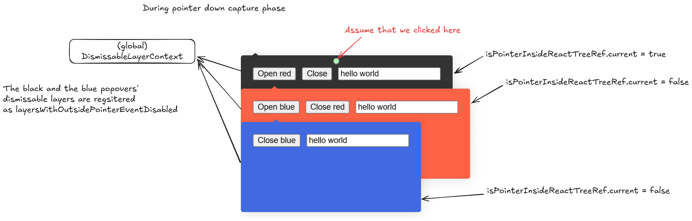
);Here’s a simplified breakdown of how it works:
- Layer Registration: All active
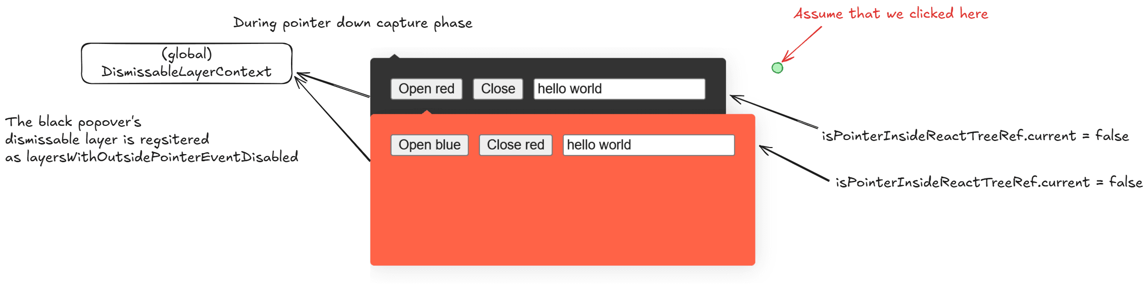
DismissableLayerinstances are tracked in aSet(which, in JavaScript, maintains insertion order). - Capture Phase: When a “pointer down” (like a click) happens anywhere, the event travels down the DOM (capture phase). Each layer uses an
onPointerDownCapturehandler to check if the click started inside its own DOM tree. If it did, it flags itself (e.g.,isPointerInsideReactTreeRef = true). - Bubble Phase: The event then travels up the DOM (bubble phase). Now, each layer checks if the click started outside of it. If so, it checks if it’s the “topmost” layer that should react (respecting
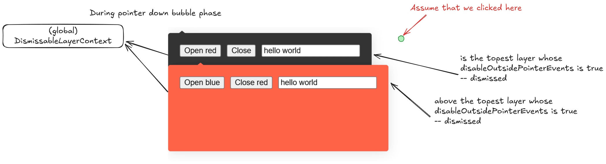
disableOutsidePointerEventson parent layers). - The Result: This clever capture/bubble logic allows Radix to precisely determine which layer (if any) should be dismissed.
In the example, when all three popovers are open, clicking outside the blue popover only dismisses the blue one. The black and red layers ignore the click because their disableOutsidePointerEvents prop effectively “protects” them.
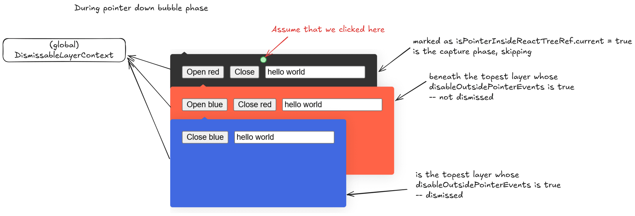
However, if you click outside the black popover (the base layer), both the red and black popovers are dismissed.
FocusScope: Trapping Focus Within Popovers
Proper focus management is a cornerstone of accessibility, especially for components like dialogs, modals, or popups. When a modal opens, focus must be “trapped” within it, preventing users from accidentally tabbing to elements on the page underneath.
This is exactly what FocusScope handles. For example, dialog content is wrapped in a FocusScope component:
const DialogContentImpl = React.forwardRef<DialogContentImplElement, DialogContentImplProps>(
  (props: ScopedProps<DialogContentImplProps>, forwardedRef) => {
    const { __scopeDialog, trapFocus, onOpenAutoFocus, onCloseAutoFocus, ...contentProps } = props;

    return (
      <>
        <FocusScope
          asChild
          loop
          trapped={trapFocus} // This is the key prop
          onMountAutoFocus={onOpenAutoFocus}
          onUnmountAutoFocus={onCloseAutoFocus}
        >
          <DismissableLayer
            // ...
          />
        </FocusScope>
      </>
    );
  },
);
At its core, FocusScope “forces” focus to remain within its boundaries. Here’s how:
- Tab Looping: It uses an
onKeyDownhandler to listen forTabkey presses. If the user is on the last focusable element and hitsTab(or the first element and hitsShift+Tab),FocusScopeprevents the default browser behavior and instead loops the focus to the first (or last) element inside the scope. This is enabled by theloopprop. - Focus Trapping: It also uses
focusinandfocusoutevent listeners. If focus somehow does leave the scope (e.g., by a script or an edge case), thefocusouthandler detects it and immediately moves focus back to the previously focused element inside the scope.
Conclusion
I personally like Radix very much. Because while many libraries focus on the visual, Radix UI provides powerful, unstyled primitives to manage the structure and the beviour, leaving the styling to you (as projects like shadcn/ui demonstrate). This separation of concerns allows you to build custom components that are both visually stunning and functionally robust. Out of the same reason, I like Angular Material as much as well because of its CDK .
CC BY-NC 4.0 2025 © Evan HuRSS